
Key Takeaways:
- Candlestick shapes reveal immediate shifts in market buying and selling power.
- Support and resistance boundaries identify high-probability entry and exit trade zones.
- Key indicators like Moving Averages and RSI validate market trend strength.
- Enforcing position sizing and stop-loss limits protects overall trade portfolio capital.
Mastering Technical Analysis Basics for Indian Crypto Traders
Technical analysis tracks price history using visual charts to anticipate future market directions. Indian market participants rely on these visual tools to evaluate trading options accurately. Learning technical concepts allows retail traders to make data-driven entry and exit decisions. Applying structured charts can improve timing across both short-term volatility and long-term crypto trends.Understanding Price Action Fundamentals
Price action forms the core foundation of technical analysis in modern financial trading. It focuses purely on historic price movement rather than external news events. Traders analyze chart structural swings to gauge current market sentiment. Evaluating price action helps investors identify emerging trends before major market moves occur.The Role of Market Supply and Demand
Market prices fluctuate based on the continuous interaction between buyers and sellers. High buying demand pushes prices higher as supply contracts across order books. Conversely, strong selling pressure drives asset values lower when demand drops significantly. Recognizing supply and demand zones allows traders to enter trades near key turning points.Timeframes for Indian Crypto Traders
Selecting appropriate chart timeframes depends on your individual trading strategy and goals. Day traders analyze short timeframes like 5-minute or 15-minute charts for quick setups. Swing traders prefer 4-hour or 1-day charts to capture multi-day market trends. Combining multiple timeframes provides a complete picture of broad crypto market movements.Reading Candlestick Charts and Price Movements
Japanese candlestick charts provide rich visual information about price movements within specific timeframes. Each candlestick displays four critical price points: Open, High, Low, and Close (OHLC). Understanding candlestick anatomy allows traders to interpret market dynamics rapidly during volatile market sessions. Red candlesticks show bearish selling, while green candlesticks signal bullish buying control.Deciphering Candlestick Anatomy
A single candlestick consists of a central body and extended upper or lower wicks. The main body represents the distance between opening and closing market asset prices. Wicks illustrate the absolute high and low price extremes reached during the timeframe. Long wicks indicate strong price rejection by either market buyers or active sellers.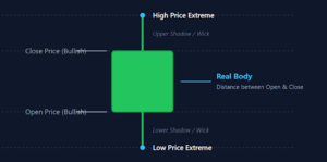
Bullish Candlestick Patterns
Bullish candlestick formations signal potential upward price reversals after prolonged market downmoves. A Hammer candle features a small body with a long lower shadow wick. This shape indicates that buyers aggressively pushed prices back up after initial heavy selling. Bullish Engulfing patterns occur when a large green candle completely covers the previous red candle body.Bearish Candlestick Patterns
Bearish candlestick signals alert traders to prospective downward price turns at upper resistance levels. A Shooting Star candle presents a long upper wick paired with a small lower body. This visual pattern indicates that sellers successfully rejected an aggressive intraday rally. Bearish Engulfing candles feature a large red candle body completely wrapping around the prior green candle.Key Candlestick Types for Beginners
The following table outlines core technical indicators. It also details their primary uses, calculation types as well as default parameter settings:| Candlestick Pattern | Visual Shape Structure | Market Signal Type | Key Location Zone |
|---|---|---|---|
| Hammer | Small upper body, long lower wick | Bullish Reversals | Bottom of Downtrend |
| Bullish Engulfing | Large green body covers red body | Strong Bullish Momentum | Support Level |
| Shooting Star | Small lower body, long upper wick | Bearish Reversals | Top of Uptrend |
| Bearish Engulfing | Large red body covers green body | Strong Bearish Momentum | Resistance Level |
| Doji | Cross shape, minimal real body | Market Indecision | Consolidation Zone |
Table 1: Essential Candlestick Patterns and Market Sentiment Signals
Identifying Technical Support and Resistance Levels
Support and resistance levels mark essential horizontal price boundaries on a trading chart visual display. These key zones reflect historical price levels where market buying or selling orders accumulate heavily. Mapping horizontal support and resistance allows retail traders to spot prospective trade entry and exit targets. Identifying these zones forms the primary backbone of cryptocurrency trading for beginners.Mapping Horizontal Support Levels
Support levels represent lower price floors where buying demand routinely halts downward market declines. Institutional buyers often place large accumulation orders near these historical price floors. When prices drop toward support, purchasing volume typically increases to defend the price level. A confirmed break below support signals that sellers have gained full market control.Drawing Support Lines Accurately
Identify horizontal price zones where price bounced multiple times upward on historical chart views. Connect at least two or three historical swing lows using a straight horizontal line. Avoid drawing lines through solid candlestick bodies to maintain clean technical reference points. Horizontal support zones offer logical places to look for long trade opportunities.Validating Support Zone Strength
Support zones become stronger each time price tests the level without breaking through. Higher trading volume during a support bounce confirms strong buyer interest at that level. However, repeated tests within short timeframes can weaken the support level over time. Always wait for price confirmation before executing trades at historic support lines.Setting Resistance Ceilings
Resistance levels mark upper price ceilings where selling pressure routinely caps upward market rallies. Traders holding long positions frequently take profits as prices approach these resistance areas. Short sellers also enter the market near resistance to profit from potential price drops. A decisive break above resistance indicates powerful bullish buying momentum across exchanges.Spotting Resistance Zones
Look for historical chart peaks where upward price advances stalled out and reversed lower. Draw horizontal resistance lines across multiple price peaks to identify current price ceilings. Track how price reacts whenever market rallies reach these historic resistance levels. Resistance levels often flip to act as new support zones once broken upward.Utilizing Essential Technical Indicators Wisely
Technical indicators apply mathematical calculations to past price data to evaluate market trends and momentum. Retail traders use indicators to validate chart signals before opening trading positions. Relying on two or three clean indicators prevents screen clutter and conflicting technical analysis signals. The combination of price action and technical indicators improves overall trade strategy execution.Trend Analysis with Moving Averages
Moving averages smooth out choppy price fluctuations to highlight clear underlying market trends. The Simple Moving Average (SMA) calculates average closing prices over a chosen historical period. The Exponential Moving Average (EMA) applies greater weight to recent asset price changes. Using moving averages simplifies trend identification across both short and long timeframes.Utilizing the 50-Day Moving Average
The 50-day moving average tracks medium-term trend direction for active digital asset traders. A rising 50-day average sloping upward confirms a strong sustained market uptrend. Prices trading above the 50-day average indicate that buyers remain in firm overall control. Many traders view dips toward the rising 50-day average as potential buy setups.Understanding Golden and Death Crosses
A Golden Cross occurs when a short-term moving average crosses above a long-term average. This bullish signal confirms the potential start of a major long-term market uptrend. A Death Cross happens when the short-term average crosses below the long-term line. This bearish event warns traders of incoming extended downward price trends across markets.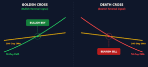
Measuring Momentum with RSI
The Relative Strength Index (RSI) measures price momentum on a scale from 0 to 100. RSI helps traders determine whether an asset is overbought or oversold in current conditions. Integrating RSI momentum readings with price support improves overall trade execution accuracy significantly. Practicing RSI techniques aids cryptocurrency trading for beginners working to build systematic entry rules.Identifying Overbought and Oversold Conditions
RSI readings above 70 indicate overbought conditions where price may undergo a pullback. Traders avoid opening new long positions when RSI enters overbought market territory. RSI values below 30 signal oversold conditions where selling pressure might be exhausting. Oversold readings alert traders to look for prospective bullish reversal candlestick patterns.Comparing Technical Indicators
The table below outlines core technical indicators, detailing their calculation types, primary uses, and default parameter settings:| Indicator Name | Calculation Method | Primary Indicator Purpose | Default Settings |
|---|---|---|---|
| Simple Moving Average (SMA) | Equal-weighted price average | Smooth price trends | 50-day / 200-day |
| Exponential Moving Average (EMA) | Weighted to recent prices | Quick trend identification | 9-period / 21-period |
| Relative Strength Index (RSI) | Price gain vs loss ratio | Momentum & overbought levels | 14-period |
| MACD | Moving average convergence | Trend momentum shifts | 12, 26, 9-period |
Table 2: Core Technical Analysis Indicators for Crypto Chart Reading
Technical Chart Patterns and Formations
Chart patterns form distinct geometric shapes over extended trading periods across historical price charts. These visual patterns reflect market consolidation before continuation or major trend reversals occur. Recognizing chart pattern structures allows traders to anticipate potential breakout moves ahead of time. Pattern trading provides clear target projections based on measured move calculations.Classic Reversal Patterns
Reversal patterns signal that the current prevailing trend is losing momentum and changing direction. The Head and Shoulders pattern is a famous bearish reversal setup found at market peaks. It consists of a high peak flanked by two smaller side peaks along a neckline. Double Bottom patterns display two distinct price troughs at support, signaling bullish upward reversals.Trading Head and Shoulders Patterns
Wait for price to break cleanly below the neckline support to confirm the Head and Shoulders setup. Calculate potential target profit levels by measuring the distance from head peak to the neckline. Place protective stop-loss orders just above the right shoulder to manage potential risk tightly. Never enter reversal trades early without waiting for confirmed technical breakout closes.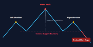
Trading Double Bottom Formations
Double Bottom patterns develop when price bounces off a support level twice in a row. The peak between the two bottoms forms the critical resistance trigger level for entries. A breakout above the central peak confirms the pattern and offers long trade entries. Measure pattern height to estimate prospective upward profit targets after breakout confirmation occurs.Continuation Chart Formations
Continuation patterns indicate that the market is taking a temporary pause before resuming its trend. Ascending Triangles feature a flat top resistance line paired with rising higher swing lows. Flags and Pennants are short consolidation patterns that appear after sharp upward or downward moves. Trading continuation patterns align retail traders with existing broad market trend momentum.Triangles and Breakouts
Ascending Triangles demonstrate aggressive buying pressure building steadily against a flat resistance line. Descending Triangles represent flat bottom support lines while also representing progressively lower price high peaks. Symmetrical Triangles display converging trendlines while price consolidates into a tight and narrow wedge. Wait for a high-volume candle close outside the triangle boundary to execute trades.Risk Management Protocols for Beginner Traders
Protecting trade capital is the absolute top operational priority for every active retail trader. Implementing disciplined risk controls prevents bad individual trades from destroying your overall trading account balance. Successful trading relies on risk management rather than attempting to guess market moves perfectly. Consistently practicing capital management is crucial for cryptocurrency trading for beginners aiming for long-term survival.Enforcing Capital Allocation Rules
Position sizing determines how many units you buy based on risk parameters and account balance. Never risk more than 1% or 2% of total trading equity on any single position. Restricting trade risk ensures you can withstand consecutive losses without damaging your portfolio. Disciplined allocation separates professional market execution from gambling behaviors.Calculating Trade Position Sizes
Calculate exact trade sizes using your stop-loss distance and fixed risk amount. Divide your maximum loss amount by the percentage distance to your technical stop-loss. The resulting number indicates the exact total position size you can safely buy. Adjust trade sizes smaller when trading highly volatile digital assets to maintain safety limits.Managing Account Risk Ratios
Always target trade setups that offer favorable risk-to-reward ratios before placing orders. Aim for a minimum risk-to-reward ratio of 1:2 on every setup you evaluate. A 1:2 ratio means risking 100 rupees to target potential gains of 200 rupees. High reward ratios keep your account profitable even with modest overall trade win rates.Risk Management Metric Guidelines
The table below summarizes essential risk management rules, target ratio parameters, and practical implementation guidelines.| Management Principle | Target Parameter | Primary Trading Objective | Practical Implementation |
|---|---|---|---|
| Max Trade Risk | 1% – 2% of account capital | Capital preservation | Cap max single trade losses |
| Risk-to-Reward Ratio | Minimum 1:2 ratio | System profitability | Target gains 2x larger than risk |
| Stop-Loss Execution | Set on order entry | Prevent catalogic drawdown | Use automated market stop orders |
| Max Daily Drawdown | 5% total portfolio cap | Prevent emotional trading | Halt trading after daily loss cap |
Table 3: Capital Risk Management Standards for Digital Asset Trading
Step-by-Step Chart Reading Checklist
Follow this systematic checklist to analyze crypto charts before executing any market orders:- Identify the primary market trend on high timeframes like daily or 4-hour charts.
- Mark key horizontal support floors and upper resistance ceiling levels clearly.
- Spot active candlestick reversal signals near key historical support or resistance lines.
- Verify trend momentum using indicator tools like Moving Averages and RSI lines.
- Calculate your exact trade position size using strict 1% account risk limits.
- Place an automated protective stop-loss order immediately upon trade entry execution.